Blue Origin
Brand Identity Design
Project Overview
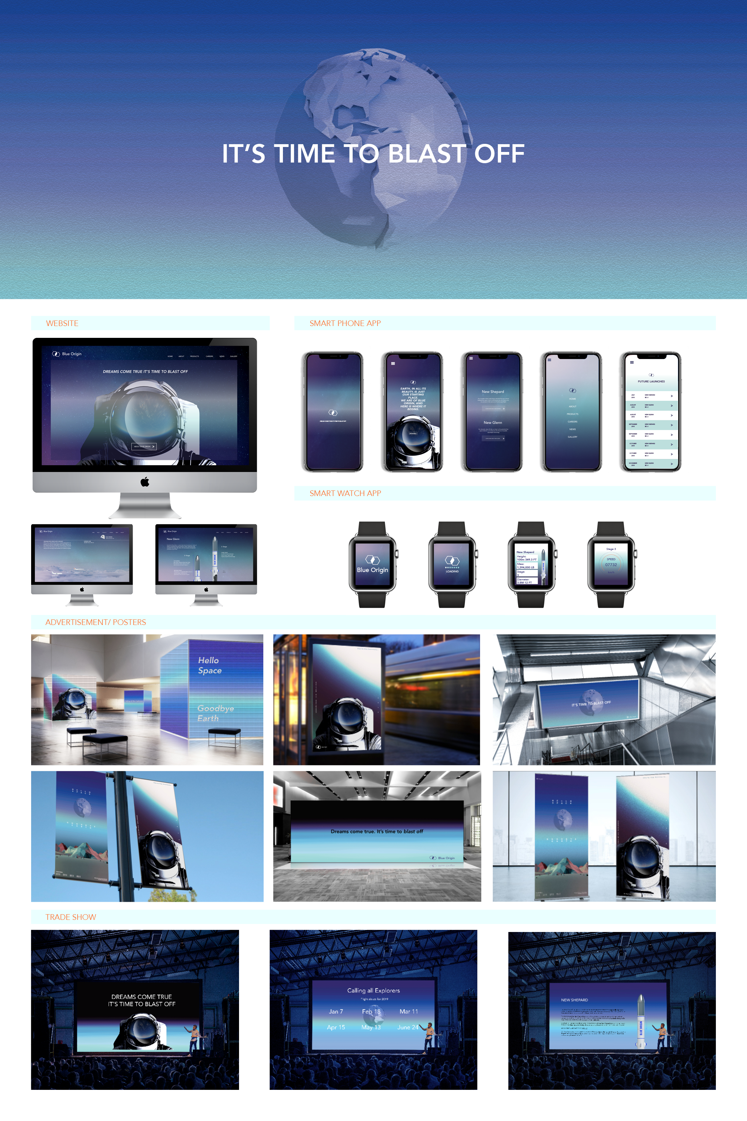
“Calling All Explorers”
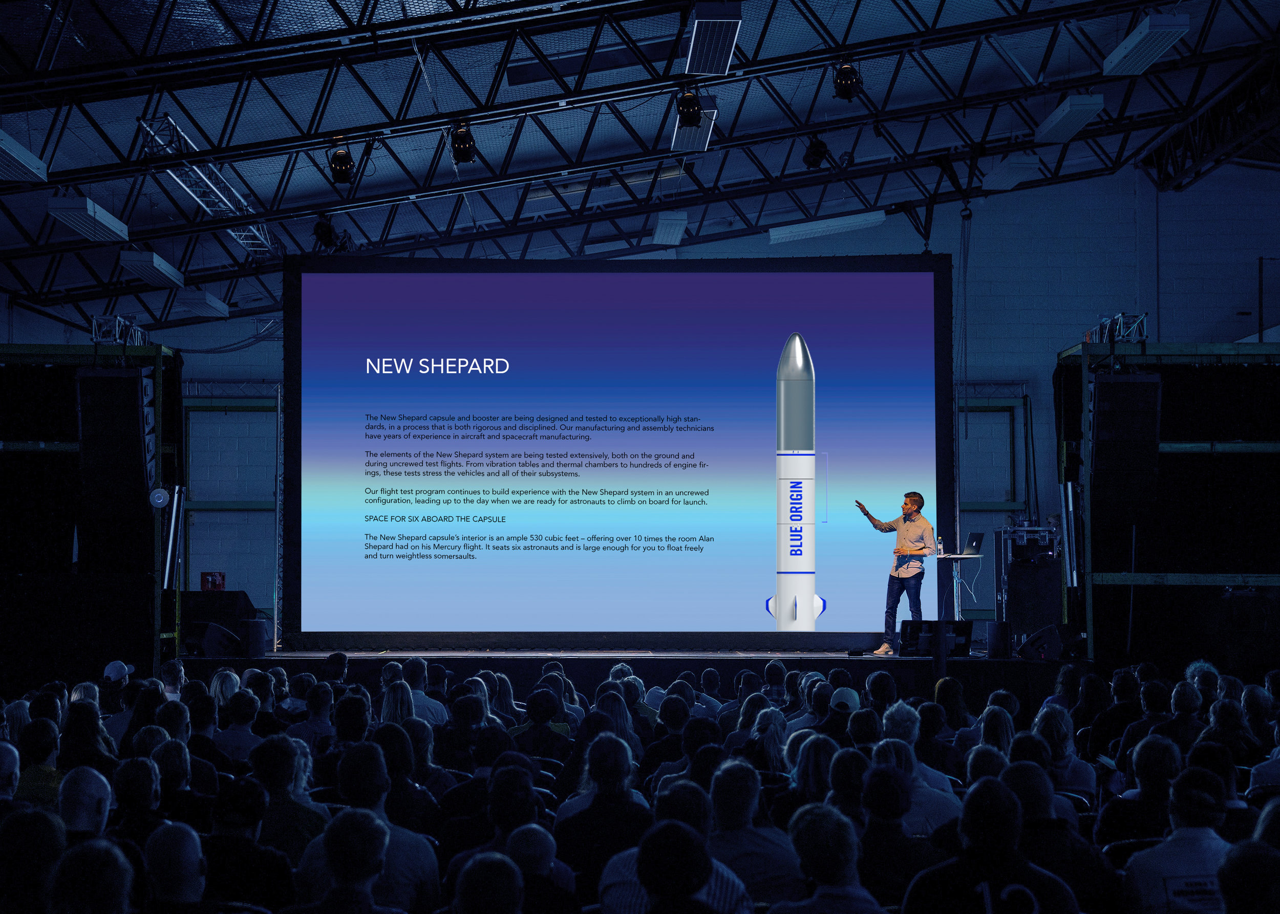
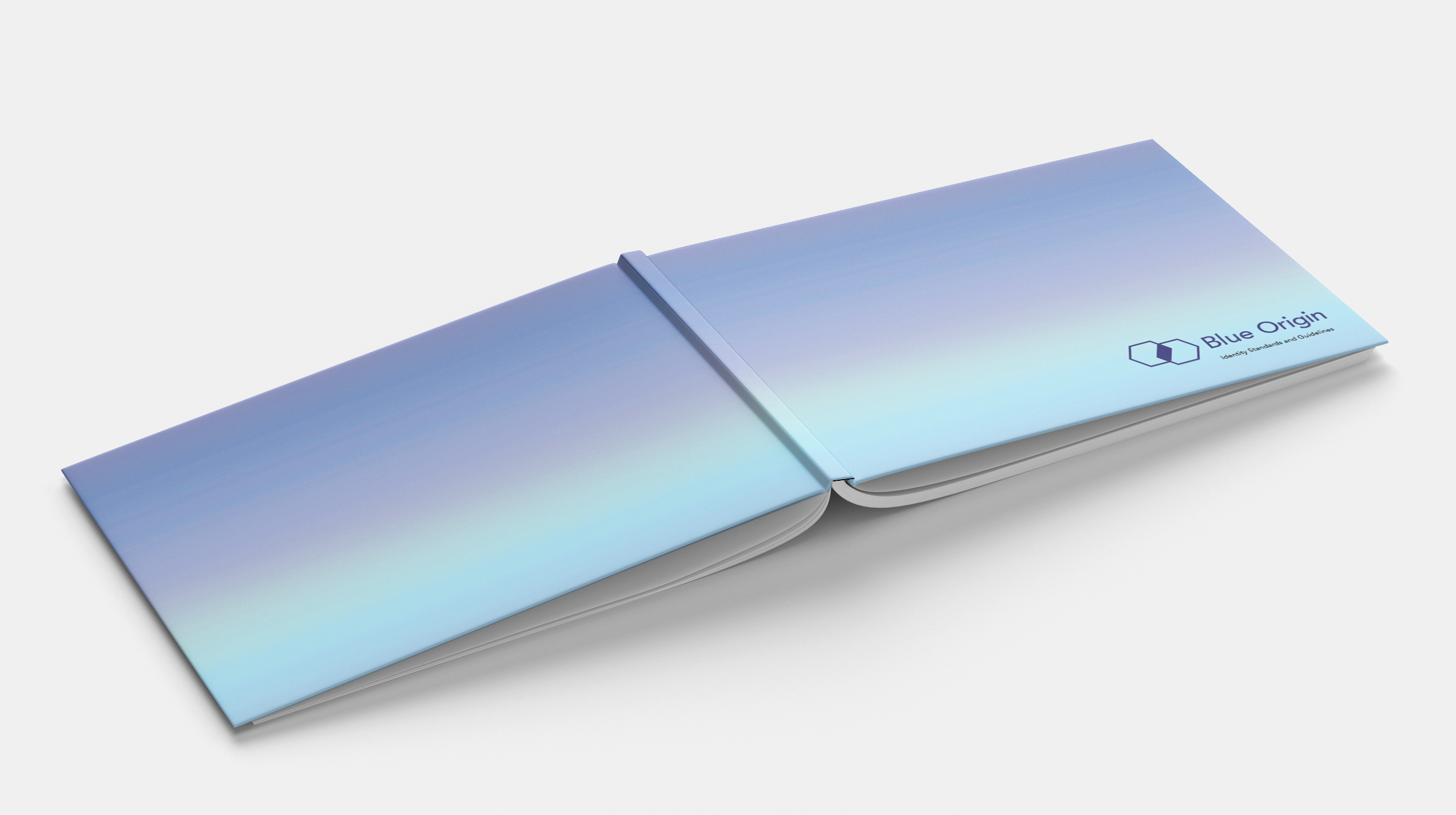
Blue origin is an aerospace company that enables human to access outer space, especially those planning to go to Mars. Currently, Blue Origin’s identity is not friendly and is severe, so I decided to change the value of Blue Origin’s identity to be friendly and more approachable. Because it is such a new experience for people, the new identity, as well as the logo, represents a chain where Blue Origin is a connection to people and space.
블루 오리진은 인간이 우주, 특히 화성에 갈 계획을 세운 사람들이 우주에 접근할 수 있도록 하는 항공우주 회사입니다. 현재 블루오리진의 아이덴티티는 우호적이지 않고 엄격하기 때문에 블루오리진 아이덴티티의 가치를 친근하고 사람들에게 접근하기 쉽게 브랜드 이미지를 바꾸기로 했습니다. 사람에게는 너무나 새로운 경험이기 때문에 새로운 아이덴티티와 로고는 Blue Origin이 사람과 공간을 연결하는 체인을 나타냅니다.